Overview
The Client
As part of my UX/UI studies at King’s College, I led the design strategy for a group project with an award-winning microbiome testing lab. The lab provides clinical-grade diagnostic services for healthcare providers across the UK.
My Role
UX Researcher and UI Designer
The Challenge
The goal was to reduce the registration form’s completion time, increase user data consent, and ensure the designs were white-labelling friendly.
Research & Planning
The project kicked off with a site visit to the client’s lab to immerse ourselves in their service and product. Following a collaborative Q&A, we adopted a cross-functional approach, with the whole team contributing to every phase of research to ensure diverse perspectives. We analysed current questionnaire trends and audited the existing version, developing empathy maps, user journeys, and personas that served as the foundation for our ideation.
The Problem statement
Users struggle to complete the registration form as it is long, unclear, and visually unengaging. Vague, repetitive questions and an ambiguous research purpose cause confusion and discouragement, leading to incomplete submissions. This results in less accurate clinical reports, reduced research participation, and a weak first impression that erodes brand trust.
User flow - To identify friction points and enhance the completion experience, I mapped a detailed user flow. By exploring alternative paths and edge cases, I clarified the logic of the design process and highlighted the specific components required to achieve our goals.
Personas & Journey Mapping
Based on our research, I created two distinct personas—a ‘health optimiser’ and a user with specific health concerns—to ensure the form addressed their differing motivations. Mapping their journeys allowed us to identify user pain points at every stage, directly informing our final design decisions and feature prioritisation.
Designing a working prototype
Low fidelity ideation
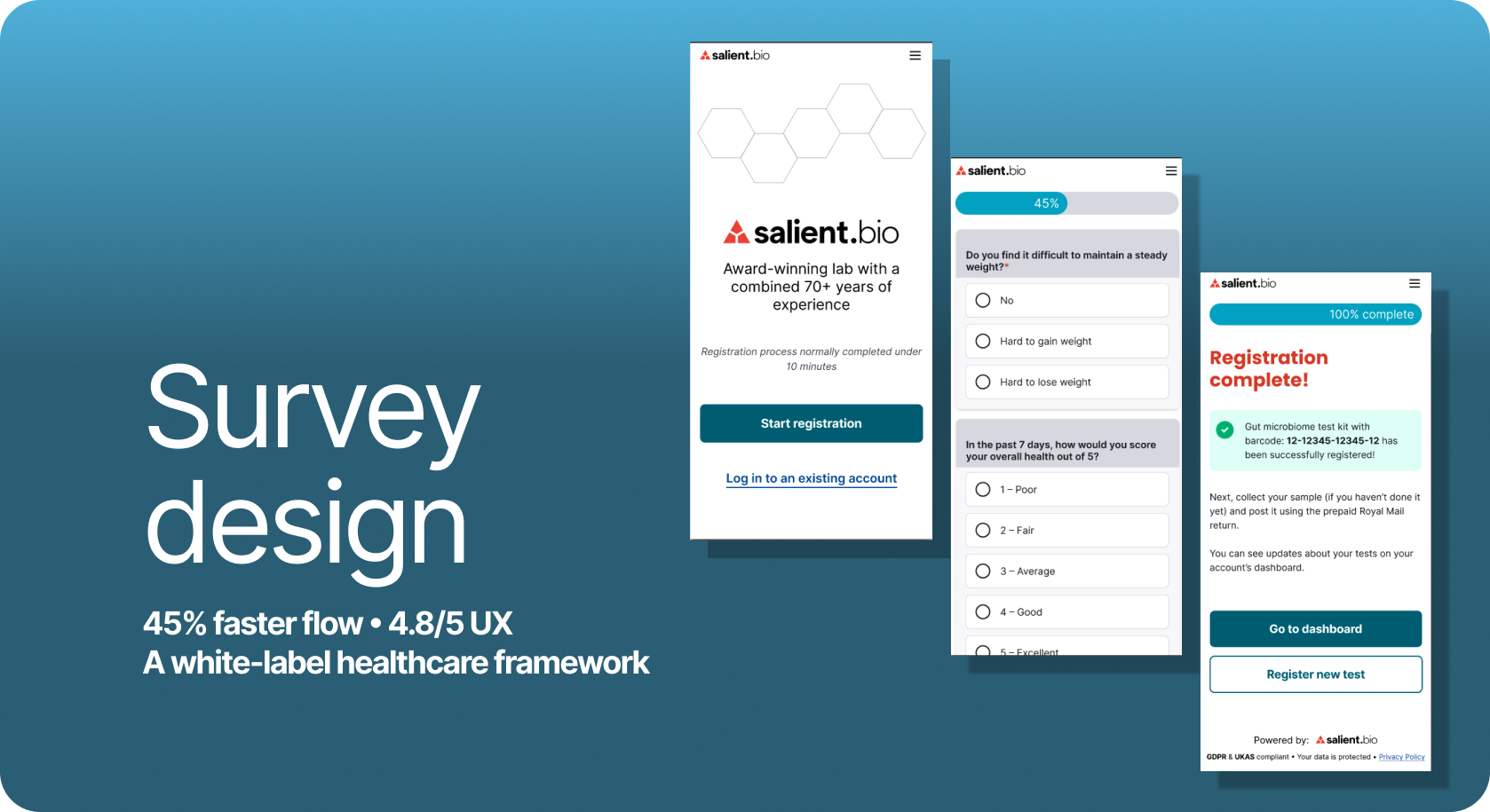
My goal was to balance scientific authority with a welcoming user experience. I focused on building trust immediately by surfacing medical credentials and "award-winning" accolades upfront. To improve the user flow, I proposed a modular box system and a persistent progress bar, both of which were adopted by the team to create a more structured and transparent journey.
I also advocated for a ‘Save Draft’ feature to give users maximum flexibility when completing long clinical forms. To ensure the design met the white-labelling requirements, I designed the modular system to allow for effortless colour customisation while maintaining "Powered by" brand consistency across third-party providers.
Prototype design for user testing
Transitioning from low-fidelity wireframes to a functional prototype, we prioritised accessibility and user control. I led the creation of a comprehensive design system in Figma utilizing auto-layout and components. This technical foundation allowed us to test global colour updates with a single click, ensuring the white-label requirement was technically viable before moving to high-fidelity.
The Refiment
Following initial user testing and client feedback, we refined the interface for a high-fidelity presentation. We developed the prototypes using Auto Layout and a robust component-based system, ensuring the design was not only scalable but also effortless to iterate.
To further enhance the user experience, I made the progress bar more prominent to provide clear, real-time visual feedback. We also integrated a comprehensive footer featuring company credentials and explicit GDPR compliance information. This reinforced the lab’s professional standards and ensured total data transparency, addressing the initial challenge of increasing user consent and trust.
Conclusion
The redesign successfully met all the core objectives of the brief, balancing the technical requirements of the lab with a significantly improved user experience. By validating our improvements through usability testing with eight participants, we confirmed that the new architecture solved the initial friction points while keeping white-labelling at the forefront of the design strategy.
Operational Success: The refined registration flow reduced completion time by 45%, directly solving the issue of long, unclear forms.
White-Label Readiness: From the earliest sketches to the final prototype, I ensured the modular box system was technically robust, allowing the client to swap branding and colours for different healthcare providers without breaking the layout.
User Trust & Consent: The redesign achieved a near-perfect ease-of-use score of 4.8/5, proving that the modular design and clear GDPR information successfully built user confidence.
Client Delivery: The project received a high distinction. The client praised our ability to deliver a solution that balanced professional branding with improved user autonomy and long-term commercial flexibility.
Reflection
Bridging Teamwork and Efficiency This project taught me that while inclusive teamwork is vital, efficiency requires a firm "design language" from the start to prevent scope creep. By establishing a clear technical foundation early, the team remained aligned even as the project grew in complexity.
Designing Without Ego One of my most significant takeaways was learning to separate ego from the art. I now treat tough critique as objective data for the next iteration rather than a personal slight. This shift allows me to detach emotionally, ensuring the focus stays exactly where it belongs: on refining the product for the end user.
Have questions about my process or just want to chat about the design? I’d love to hear your thoughts. Get in touch.