Note: This case study is an independent portfolio project for educational purposes only and is not officially affiliated with or commissioned by Urban Tropicana.
Overview
The Client
As part of my UX/UI studies at King’s College, I developed a case study for Urban Tropicana, a vibrant, family-run houseplant retailer based in London. They cater to a diverse community of plant enthusiasts, offering a curated selection for both beginners and experienced collectors.
My Role
UX Researcher and UI Designer
The Challenge
The primary objective was to overhaul core UX/UI friction points to better capture user attention and build the "plant confidence" necessary to guide them through to the checkout. I focused on streamlining the discovery phase and simplifying the path to purchase for a mobile-first audience.
The Research
Before considering a new button or icon, we needed to understand the underlying motivations behind buying plants online. We employed a strategic mix of methodologies—including Jobs to be Done (JTBD), User Personas, and Customer Journey Mapping—to uncover the customer’s true pain points.
Jobs to be Done (JTBD)
To understand why people ‘hire’ a product, we turned to the JTBD framework. This revealed the emotional and functional “jobs” a plant performs—ranging from aesthetic enhancement to providing a sense of safety and confidence:
The Home Curator: "When I purchase new décor for my first home, I want to ensure the plants are 100% non-toxic and stylishly potted, so I can feel proud of my curated space without the anxiety of endangering my new puppy."
The Health Conscious: "When I am setting up my living room, I want to find a plant that is scientifically proven to improve indoor air quality, so I can signal a commitment to a healthy home environment for my family."
The Reluctant Buyer: "When I am selecting a plant online, I want clear visualisations that the care requirements are minimal and the plant is pet-safe, so I can confidently click ‘buy’ knowing I won’t waste money on something unsuitable."
User Persona: Jess, the Anxious New Homeowner
Based on user interviews, I developed Jess—a 36-year-old new homeowner with a puppy. Jess craves a beautiful, homely aesthetic but is notoriously bad at keeping plants alive. Her primary conflict is simple: she needs easy-to-care-for, non-toxic plants, but she fears buying something unsuitable and watching it die. Her anxiety demands ultra-high confidence and clarity from the product page.
Competitive analysis Customer Journey Map
While Urban Tropicana’s selection aligns with key competitors like Patch, Leaf Envy, Plant Drop, and Prickle, the website design required significant improvements to stand out. Our Customer Journey Map confirmed that new, unfamiliar users face two major pain points: finding information quickly in an oversaturated market and establishing immediate trust.
Guerrilla Testing
While our research identified the "Jobs to be Done," we needed to validate these pain points in the real world. I designed a focused guerrilla testing session around three core tasks to see how users interacted with the live site:
Product Discovery: "Imagine landing on this page from an Instagram ad. Can you determine if this plant fits your home’s light conditions and add it to your basket?"
Safety & Care Information: "Review the product page. Where would you go to confirm that this plant is safe for your pets?"
Trust & Credibility: "As a first-time buyer, where do you look on this site to feel confident enough to make a purchase?"
Key Interview Questions: To uncover the "why" behind their actions, I asked:
What, if anything, made you pause or hesitate while deciding if that plant was the right fit for your home?
What are the first three words that come to mind when you think of this brand?
What concerns, if any, do you have about proceeding with this order right now?
Key Findings & Current UX Issues
The guerrilla testing validated our initial research and highlighted three critical barriers to conversion:
Clutter Obscures Clarity: Product pages were visually cluttered. Essential cues for care (light, water, and pet safety) were hard to spot, causing instant friction and hesitation for the user.
Size Confusion: It was surprisingly difficult to gauge the true scale of the plants. Busy image backgrounds made spatial awareness a "guessing game," preventing users from picturing how the plant would fit into their own homes.
Trust is Buried: Despite a high Trustpilot rating, testing revealed a major trust deficit. Vital social proof was not presented upfront, meaning new customers had to "dig" to feel secure about their purchase.
Our next steps were clear: simplify the interface, clarify product specifications, and build immediate confidence on the product page.
The Design
My approach was guided by a core philosophy rooted in Nielsen’s Heuristics—specifically Heuristic 8: Aesthetic and Minimalist Design. I focused ruthlessly on the essentials, removing clutter to lower the user's cognitive load.
To find the right balance, I developed and tested three distinct variations in Figma. This iterative process allowed me to refine visual elements like image clarity—to help users better gauge scale—and the strategic placement of the 'Add to Basket' button for maximum conversion confidence.
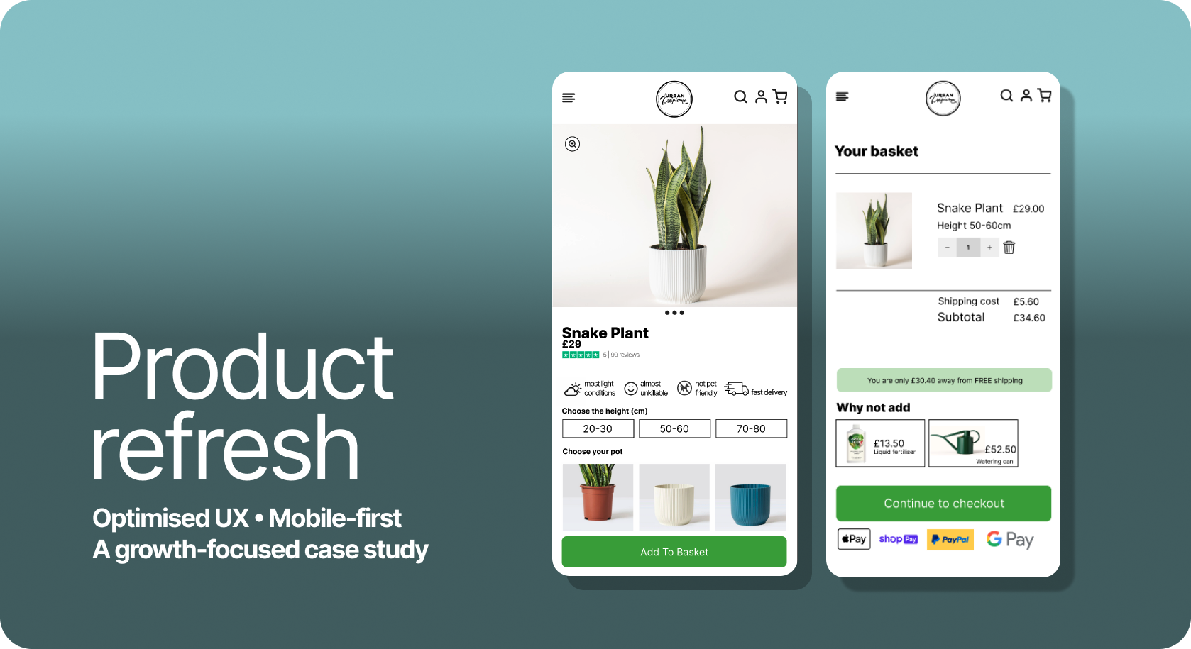
The Final Iteration
The final, minimalist design puts all essential decision-making information above the fold, directly tackling the "Clutter Conundrum" I identified during testing.
How I achieved this:
Visual-First Icons: I introduced consistent iconography to convey care requirements (sunlight, water, pet-safety) instantly. This allows users like Jess to verify a plant's suitability in seconds.
Density Control: I moved all long-form content and detailed care guides into collapsible containers. This prevents users from getting overwhelmed while still providing deep-dive details for those who choose to seek them out.
Trust & Validation: I surfaced Trustpilot ratings and "Pet-Safe" badges prominently, providing the immediate reassurance needed to move from browsing to purchase.
Reflection
The Power of Mobile-First The biggest lesson I took from this project is the absolute power of Mobile-First Design. Since users are often in the "discovery stage" while on their phones, I learned that all critical information must be clear and readily available above the fold.
Clarity Over Complexity Moving forward, I see simplicity as the key to conversion. This demands easy-to-follow visuals and icons to replace dense text, as well as product images that include clear visual measurements for essential context.
Strategic Impact Ultimately, by focusing on simplifying complex decisions—like plant ownership—through clarity and minimalism, I proved that thoughtful UX is essential for local business longevity. When we remove the "fear of failure" for the user, we create a direct path to purchase.
Have questions about my process or just want to chat about the design? I’d love to hear your thoughts. Get in touch.