Overview
The Client
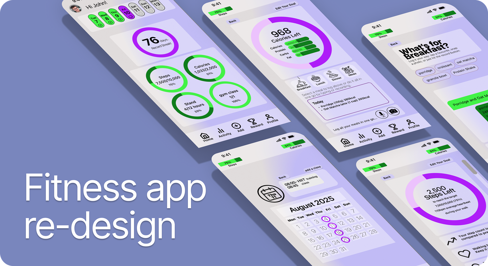
As part of the UX/UI course at King’s College, I designed an app for a fictitious fitness brand, HabitHero.
My Role
UX Researcher and UI Designer
The Challenge
To redesign the user experience to combat disengagement by transforming a lack of clear progress and feedback into a motivating and intuitive interface.
Research & Planning
After conducting a Heuristic Evaluation of the existing MVP I started the research by doing Assumption analysis to identify the basis of the design and user research plan. I conducted 3 in-depth interviews followed by 15-question survey with the aim to uncover user motivation and validate if the proposed solutions meet their fitness app needs. My goal was to assess the demand for improved visuals, healthy eating options from scanned items, enhanced gym routines, and a decluttered app interface.
Based on the results I created an affinity map which informed the creation of my personas, user journeys, user flows and storyboards.
The Problem Users become disengaged with fitness tracking when it feels like a one-way data entry task lacking clear progress or meaningful feedback.
The Goal To transform this passive interface into an intuitive, AI-driven platform that uses historical data to provide tailored advice—shifting the journey from manual logging to a motivating, personalised coaching experience.
User flow - I mapped out a high-level user flow covering key touchpoints, including account authentication as well as meal and exercise logging. This served as the blueprint for the wireframing stage, ensuring a seamless transition between the app's core features.
Low and mid fidelity wireframes
The Design Approach: I prioritised a minimalist, intuitive interface that allows users to track their goals at a glance. My focus was to balance key data with a clean aesthetic, avoiding a "corporate report" feel by using visuals rather than dense text. To ensure the experience remained scannable and cohesive, I applied Miller’s Law to prevent cognitive overload and used Gestalt principles to establish a consistent, unifying design language across the mid-fidelity stages.
Low-Fidelity Ideation
I explored various data visualisations before selecting a minimalist pie chart to maintain a modern aesthetic, while user feedback prompted me to pivot from a static time panel to a scrollable calendar. For food logging, I prototyped three concepts, ultimately settling on a chatbot-inspired interface that supports keyboard, camera, and voice input. This final direction, refined in Figma, centres around a prominent data wheel.
Prototyping & Feedback: I landed on a layout featuring a revolving top calendar and simple bottom navigation, influenced by the Apple VisionOS aesthetic. The journey starts on the homepage with interactive rings for steps, calories, and gym classes. This structure remains consistent throughout; each section opens to a dedicated page centred on a large target wheel, supported by trend data and encouraging messages to drive engagement.
The Final Design
Based on user feedback, I introduced a navigation tab and replaced the original “scan” button with a Quick Action “Add” button. This allows users to log calories or gym sessions directly from any screen, significantly reducing task completion time and improving overall accessibility.
Visual Language: The palette combines an accessible light background with low-opacity ‘liquid glass’ elements and vibrant accents. Using a triadic harmony of neon green and purple, I aimed to inject energy into the experience. These choices were intentional: green for growth and purple as a nod to creativity and luxury. While I initially experimented with a "liquid glass" effect, I pivoted to a soft background blur to ensure high contrast and legibility.
Accessibility was a primary constraint, not an afterthought. I ensured all text maintained a high contrast ratio, icons met Apple’s 44px touch target minimum, and the 16px body font followed standard readability guidelines.
The Power of a Design System I built a comprehensive style guide and typography system in Figma from the outset. By utilising global styles and variables, I was able to test different themes—such as a dark mode—and update the entire prototype instantly. This organizational foundation taught me how a structured design system allows for much greater flexibility and speed during the iteration phase.
Conclusion
This project allowed me to own the entire design lifecycle, from initial user research and testing through to high-fidelity prototyping and the final developer handover. Successfully navigating the transition from a complex concept to a structured design system resulted in the project being awarded a Distinction from King’s College.
Reflection
Staying Objective The research process taught me the importance of keeping an open mind. Instead of seeking justification for my own assumptions, I learned to truly listen to users to build solutions that solve their actual pain points rather than my perceived ones.
Empathy as a Tool Immersing myself in the personas I created opened up a new level of creative problem-solving. Viewing the journey through their specific needs made the design feel more intentional and personal.
The Learning Curve Mastering Figma required an iterative approach. I found that deconstructing established design patterns and studying industry-standard UI tutorials helped me refine my craft and gain confidence with the tool.
The Reality Check User testing is vital. While a flow might feel completely logical to me as the designer, the moment a fresh pair of eyes interacts with the app, friction points become instantly apparent. Testing early and often is the best way to catch the things I’m too close to see.
The AI Edge: I found AI to be a game-changer for synthesising user interviews with precision. Beyond the efficiency, it acts as an objective second pair of eyes to uncover insights easily missed in the moment. It is now an essential tool in my kit for ensuring research remains thorough and unbiased.
Have questions about my process or just want to chat about the design? I’d love to hear your thoughts. Get in touch.