Overview
The Client
Farfetch is an online luxury retailer that operates in 12 languages, selling over 3000 designers, which equates to over 1 million items in the catalogue.
My Role
Product design, UX, UI and Project Management.
The Challenge
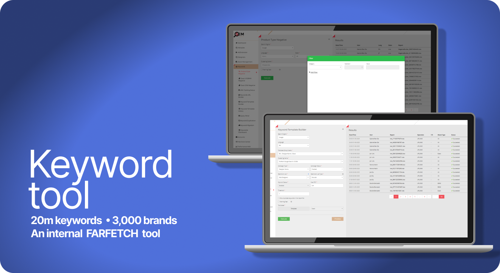
Paid search team was operating globally advertising every item in the catalogue which equated to 20 million keywords. To ensure users were directed to correct enabled landing pages we had to automate the processes.
Context & Research
The challenge was to create a scalable keyword management tool that mirrored a complex, multi-brand catalogue across 12 languages. The system required a cohesive structure that followed a strict Brand > Category > Subcategory hierarchy, ensuring that our search engine account architecture reflected our site precisely while staying within technical limitations.
The core complexity lay in the lack of visibility; we needed a central database to cross-reference our live product feed with our search engine accounts. By linking these databases, we could identify exactly which designers were live, validate that every keyword pointed to a functioning URL, and implement a system to automatically create, pause or enable keywords based on real-time stock levels. This ensured a unique, duplicate-free account structure that was both commercially agile and technically sound.
Problem statement
There is currently no centralised method to verify if our search coverage encompasses the entire product catalogue. This lack of visibility creates a significant commercial risk: traffic is frequently directed to invalid landing pages or out-of-stock items, resulting in inefficient ad spend and lost revenue.
Furthermore, the process is heavily reliant on manual labour. Managing these discrepancies across thousands of designers and categories is a resource-intensive task that is prone to human error. Without an automated way to sync real-time stock levels and URL validity with our search accounts, we are unable to optimise our spend or scale our operations effectively.
The Workflow: Automated Keyword Synchronisation
The Workflow: Automated Keyword Synchronisation
Phase 1: User Initiation The user selects a logic template and triggers the "Keyword Job," prompting the tool to sync real-time stock data with existing search coverage.
Phase 2: System Logic Working in the background, the system identifies new designers and categories across all live regions. It automatically deduplicates keywords and synthesises validated Final URLs to ensure 100% accuracy.
Phase 3: Validation & Deployment After a quick manual review, the user pushes the file to the search engine. The engine performs final safety and 404-checks before going live.
Phase 4: Feedback Loop Post-deployment, a report is fed back into the tool for final adjustments. This cycle repeats weekly to ensure the search accounts evolve alongside our ever-changing catalogue.
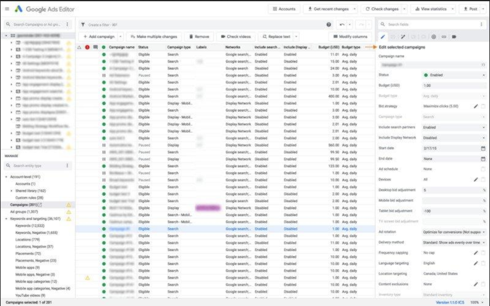
The tool’s interface inspiration came from existing Search Engine UIs, such as Google and Bing, to leverage familiarity and ensure a seamless, intuitive transition for the core team.
Designs &
Iterations
Low-Fidelity Iterations
I explored three distinct layout iterations, with a primary focus on creating a high-functioning dashboard for data-heavy workflows. The core objective was to give "central stage" to file management, allowing users to monitor success and failure rates in real-time as files propagated to the search engines.
I tested various navigation structures—placing account and language selectors at the top and on opposing sides—before finalising a streamlined left-hand navigation. This final version utilised accordion blocks to house various tools, ensuring the interface remained clean while providing quick access to complex account settings.
MVP Development & Technical Validation
Working with the engineering team to launch the MVP, we discovered a significant technical constraint: for our largest accounts, a full job could take up to six hours to process. Given the complexity of deduplicating thousands of keywords while validating URLs across multiple languages, there was zero margin for error.
Key Technical Iterations:
Risk Mitigation via Batching: To avoid the "six-hour gamble," I introduced a Small Batch Preview feature. This allowed users to launch a sample job and manually cross-check the keyword logic and URL synthesis before committing to a full-scale deployment.
UX for Retention: Initial data showed high bounce rates when keywords led to landing pages with only a single item. We iterated the system logic to ensure a minimum threshold of 10 items (or several rows) per page, improving the end-customer experience.
Streamlined Error Handling: I refined the Success/Failure (S/F) interface to include language and account identifiers. This allowed users to spot local errors instantly within a report, rather than hunting through massive datasets.
Final Design: Practicality at Scale
The final interface was designed with a focus on accessibility and operational efficiency, adopting a "simple yet familiar" aesthetic to ensure users could navigate high-density data without friction. I prioritised functionality by giving central stage to the file management system, where the success and failure metrics of every job are immediately visible.
Key Design Features:
Centralised Job Management: Each file entry includes actionable buttons, allowing users to instantly relaunch a job or edit specific errors without leaving the main view.
Streamlined Navigation: I implemented a permanent left-hand navigation bar to house the toolset and account settings. This clean, persistent structure provides a "North Star" for the user, regardless of how deep they are into a specific workflow.
Information Hierarchy: By using accordion blocks and clear status indicators, I balanced the need for deep technical detail with a cluttered-free interface, ensuring that critical data is always scannable at a glance.
Testing & Iterations
Testing & Iterations: Risk-Averse Design
Post-beta testing with the marketing teams revealed a high-stakes friction point: the "Execute" button was too accessible. With jobs taking 6 hours and generating millions of keywords, an accidental click was a catastrophic waste of time.
Key Refinements:
Strategic Friction: I deliberately moved the "Execute" button to a less intuitive location, forcing a mandatory preview step. This "speed bump" ensured users verified the logic before committing to a massive data propagation.
The "Undo" Fail-safe: To reduce user anxiety, I added an "Undo" button. This provided an immediate safety net to kill a job in its first minutes, preventing hours of manual cleanup if an error was spotted post-launch.
Product Evolution: From Tool to Growth Engine
Once the core system was stable, we transitioned from manual execution to automated optimisation. The tool evolved to run weekly updates, ensuring search accounts remained perfectly synced with shifting inventory levels.
Strategic Keyword Harvesting: To expand our advertising space, we implemented a logic to "harvest" high-performing terms from Shopping Campaigns (data-feed led). Unlike traditional keyword campaigns, these feed-led campaigns allowed us to appear against a broader range of search terms.
Automated Integration: The system identified any term that had converted at least once and automatically ingested it into our keyword accounts. Before going live, the tool cross-referenced for duplicates and generated a validated Final URL. This transformed the tool into a self-optimising loop, constantly scaling our reach while maintaining 100% data integrity.
Conclusion & Reflection
The tool successfully generated 20 million accurate keywords across 12 languages, transforming a high-risk manual process into a precision-engineered growth engine. By ensuring 100% URL validity and real-time stock synchronisation, we achieved a significant boost in Incremental Traffic and Return on Ad Spend (ROAS).
Key Results:
Commercial Growth: Increased revenue by capturing high-intent traffic and directing it to high-quality, relevant landing pages.
Operational Efficiency: Reduced manual workload by 90%, shifting the team’s focus from tedious manual labor to strategic monitoring.
Total Control: Eliminated "dark spots" in our coverage, providing the team with a full, transparent grasp of the entire global catalogue for the first time.
Lessons in Design Maturity
The project was a success, but it also highlighted the importance of early cross-functional alignment. If repeating this process, I would focus on:
Earlier Engineering Integration: Involving developers during initial ideation would have surfaced technical constraints—like the 6-hour processing time—sooner. This would have allowed the "Batching" and "Preview" safety features to be designed as core requirements rather than later iterations.
Expanded MVP Testing: Engaging a broader user group earlier would have highlighted the need for "strategic friction" (the counter-intuitive execute button) and the "Undo" fail-safe before reaching the beta phase.
Have questions about my process or just want to chat about the design? I’d love to hear your thoughts. Get in touch.